
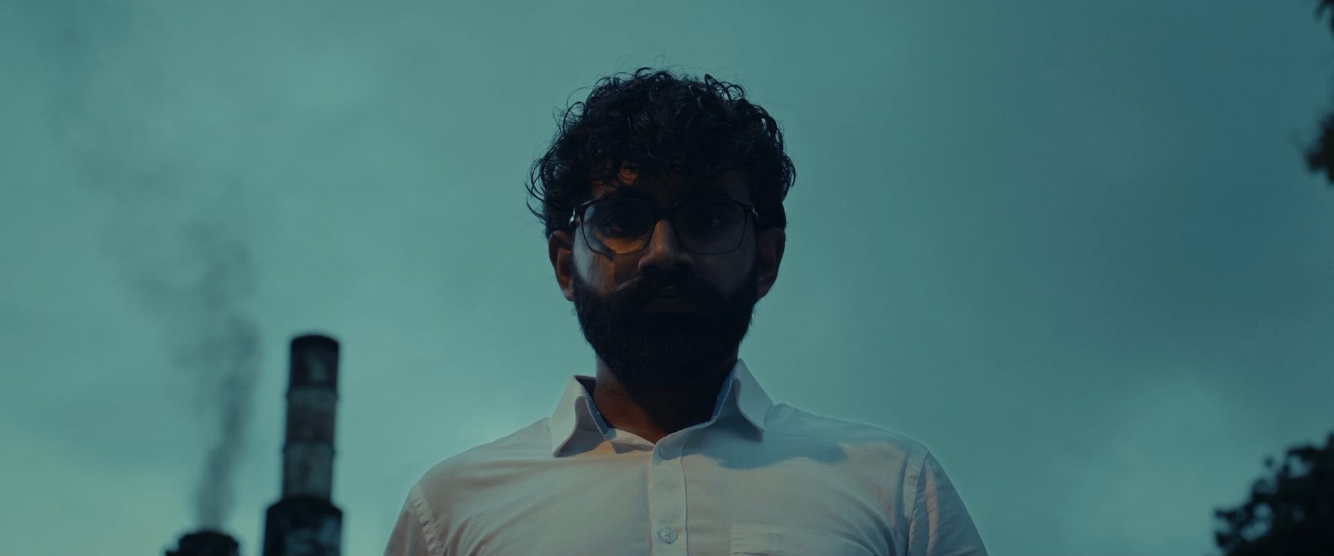
Low Light, Lower Budget, Heavy Shadows!
There’s nothing more satisfying than being the DoP and the colourist on the same project, at least for me. Now add the idea of doing that on a short film, where I can push the look in pretty much any direction and make it as cinematic as possible?
Well, that was basically my dream brief for our little Tones & Colours Original, “The Weight of Shadows.” It’s a 4 and a half minute short film directed by Andrew Sean, revolving entirely around a conversation between two characters.
Before we dive in, I’d recommend giving it a quick watch. The rest of this blog will make a lot more sense after that.
Okay, now that you’ve watched it, let’s break the process down into three parts:
● Preproduction
● Cinematography
● Colour grade
Our Convenient Pre-production Strategy
Pre-production was honestly just us walking around our own office over coffee one late evening, planning out the angles. We were also privileged enough to have a cemetery just a hop away for the final sequence, so yeah, the lazy process really helped us wrap this entire project within a week, amongst all our other client work.
We also have an infamous track record of starting T&C Originals and never actually finishing them, so getting this one across the line in a week was an achievement in itself.
Pre-production also involved shooting a few test frames to figure out what we needed to curate on the actual shoot day to optimise the look. You know, important filmmaking decisions like picking the right hoodie for Andrew ;) and rationing the number of cigarettes Samorn would need on screen.
But yeah, good pre-production + a clear train of thought = everyone happy on shoot day.
(I think?)
Shoot Day (Night)
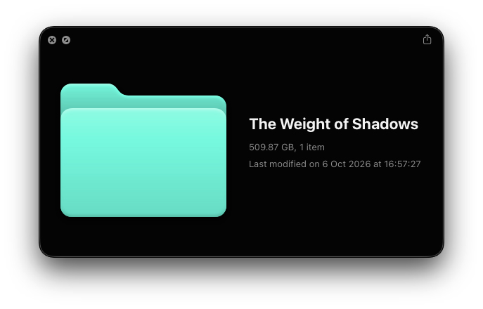
Yaay the geeky parks now! Okay so a quick run down of our equipment - the film was shot entirely on the Nikon ZR on 4K R3D NE in 25FPS (cries in 509gb storage for a 4.5 min shortfilm). BUTTTTTTT the dual base ISO of 6400 really came in clutch for our lack of light jajajajaja.
For this project, we wanted optics with a bit more character rather than using a typical photo lens and we picked out the cheapest lens kit out of the lot which we can rent out without any assistants (man, budget filmmaking is such a vibe). Well, that kit ended up being the Zeiss CP.2 5-lens kit. We had some experience using this kit in the past for some of our commercial projects but we never really had the opportunity to push it to extract its characteristics.
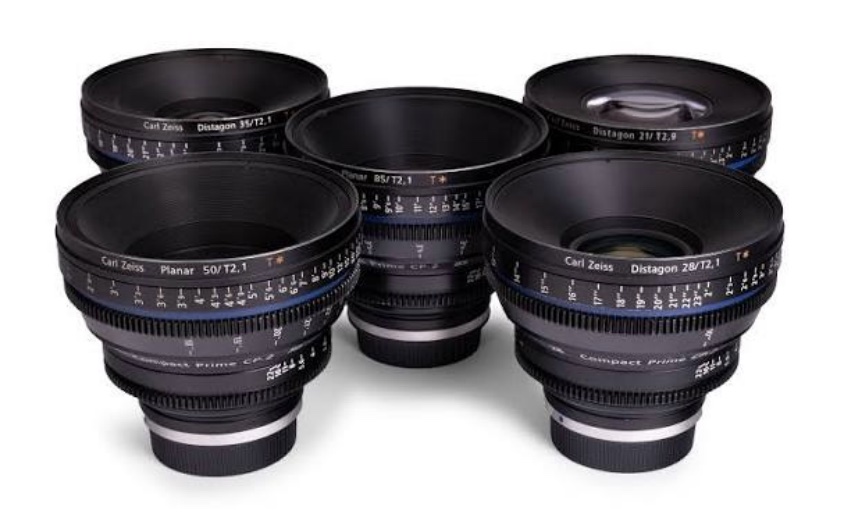
The ZEISS Compact Prime CP.2 PL Mount 5 Lens Kit
Okay now you may ask “what characteristics?”
Firstly, the lens kit is T/2.1 - the faster aperture was really important for us to squeeze out those extra stops of light, considering the big portion of the film was lowlight (more like no light, but okay). Secondly, all of those little aberrations that makes filmmaking, and human content in general feel organic and not another AI SLOP - this one’s for you AI filmmakers 😏
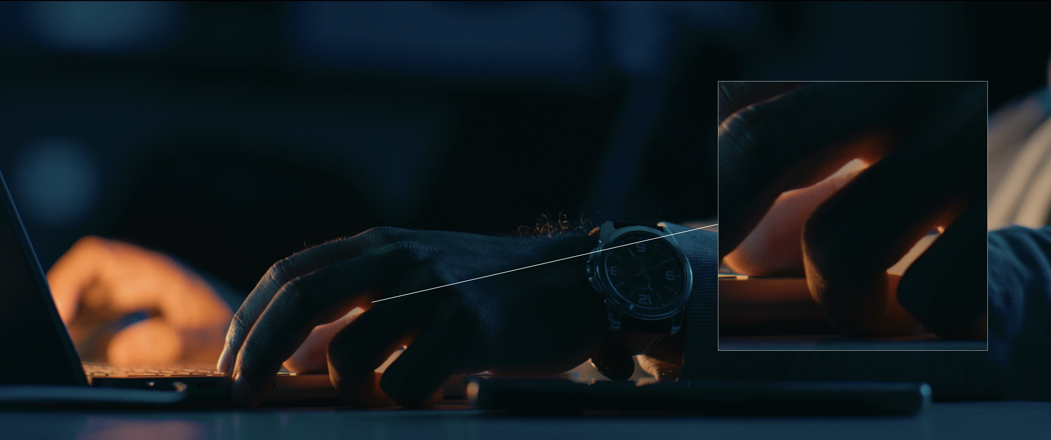
SPECIMEN NO.1 Back to technical stuff. Lenses and optics often determine the way light wraps around the subject and how sharp or clean the image is. Notice on this shot for example on how the light has a little leak around the fingers.
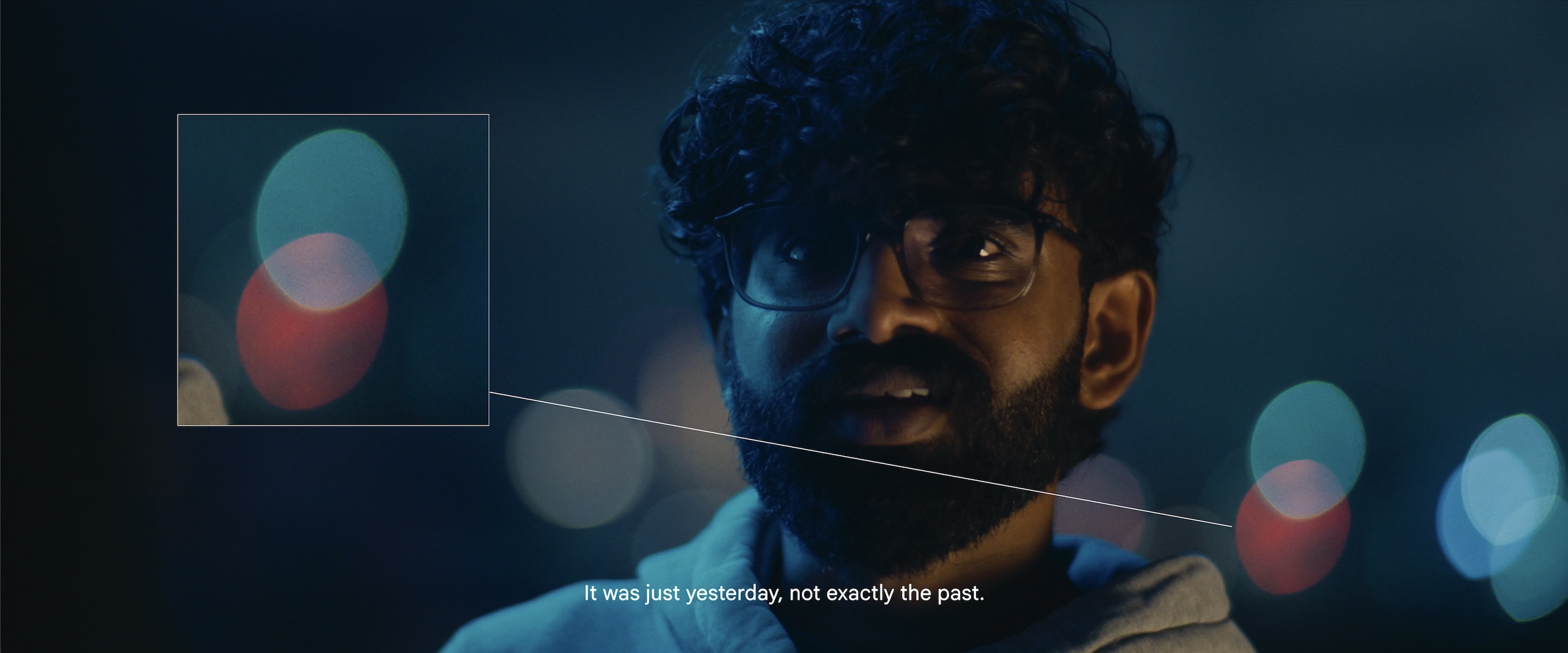
SPECIMEN NO.2 I don’t know about you, but I’m a sucker for imperfect bokeh! I mean look at those oval little mfs.
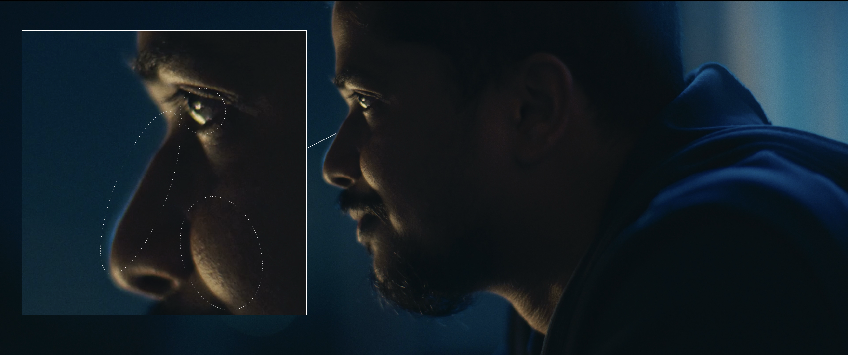
SPECIMEN NO.3 See those little chromatic aberrations and fringing? They really help bring out a sense of dreaminess and it kinda helps sell the idea that maybeeeee Andrew is already dead.
Not like I thought of all of these before picking the lens but hey, at least it’s good to bullshit about your findings to your audience 😙
Okay camera check, lens check, and now we head to lighting :)
Today’s episode of TNC is sponsored by….
Air Sports! Yeap the entirety of the balcony sequence that lights up both our characters on the key side is basically off from a signage from Air Sports! But hey there’s a certain art in utilising your environment to perfection and that’s the first biggest instinct one needs to possess as a cinematographer.
POSITIONS MATTER!
This is our entire balcony
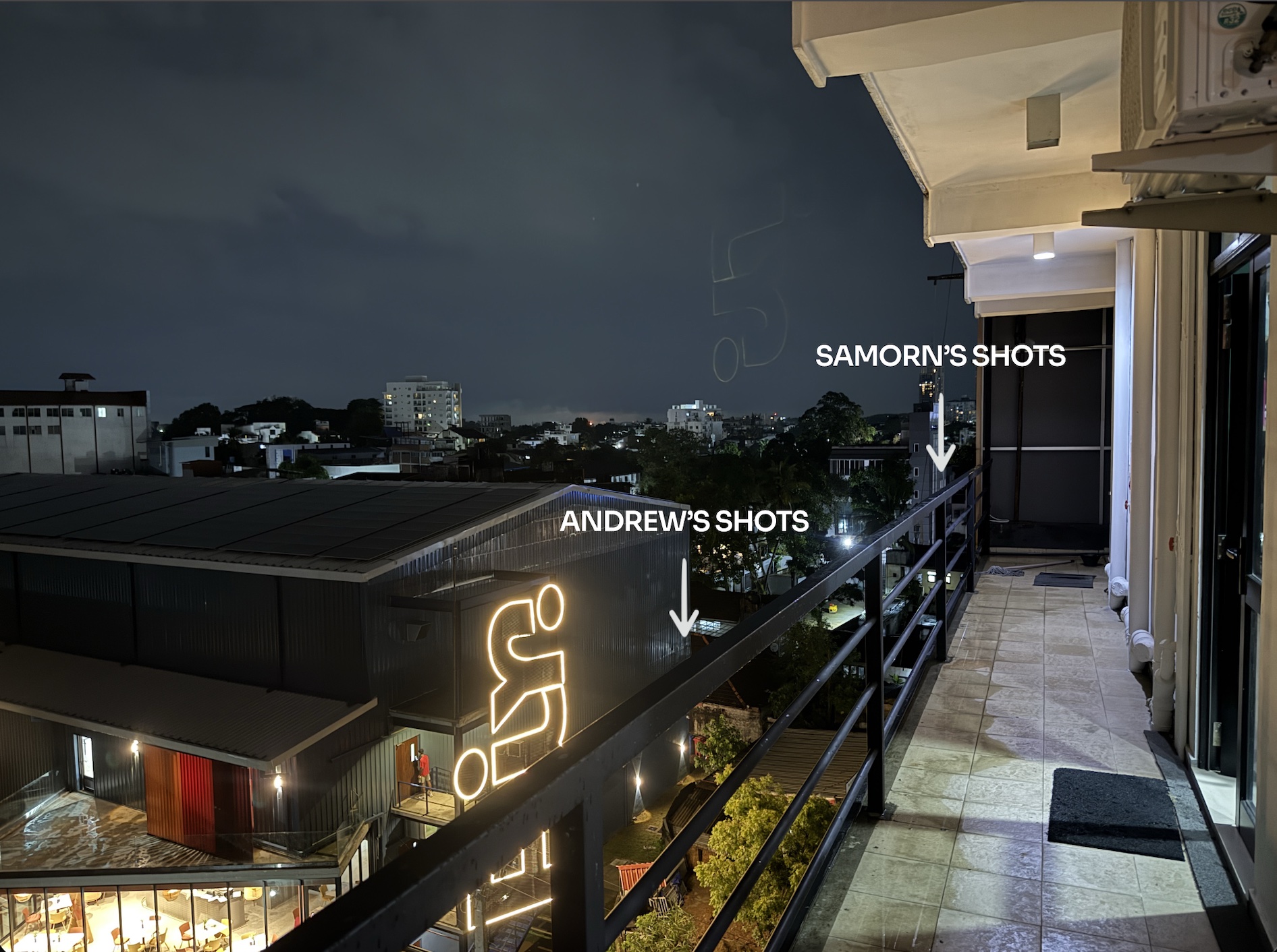
We shot all of Samorn’s sequence from one side, then moved to the opposite side to shoot Andrew’s.
This is the part where you should ask but why?
Well, for two reasons
1. So the signage is at the optimal angle to give a perfect split tone effect that bisects each half of the face to a warm side and a cold side.
2. To maximize the background bokeh, the distant lights from the buildings can really add a lot of depth and texture to what can be a very plain looking scene, and we position both of them in a way where we get the best of both worlds for each of their individual angles.
Also special thanks to Charith Attalage and team for giving us that extra bit of light on the distant sky from the Yogeshwari concert! Bro these are the details that make what we do so much more fun.
AND FINALLY the only artificial light fixture we used throughout the shoot is just an Amaran 300C set to a blue/cyan hue on the RGB mode and an Apurture MC for the first scene. And the technique was equally lazy as shown below.
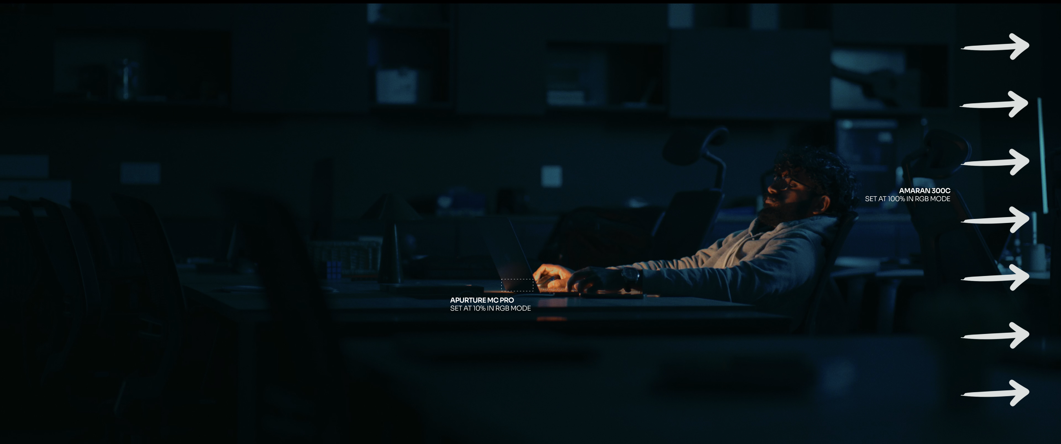
LAZY LIGHTING SPECIMEN NO.1 The main blue accent came from bouncing the 300C onto the curtains just outside the frame and letting that reflect back into the entire environment with a nice, soft fall-off. The dark furniture also helps the overall mood and finally the MC was hidden behind the laptop screen in a very specific angle to hide it. This helped accentuate the light coming off from the laptop to have a bit more colour contrast.
Okay, moving to the balcony sequence next!
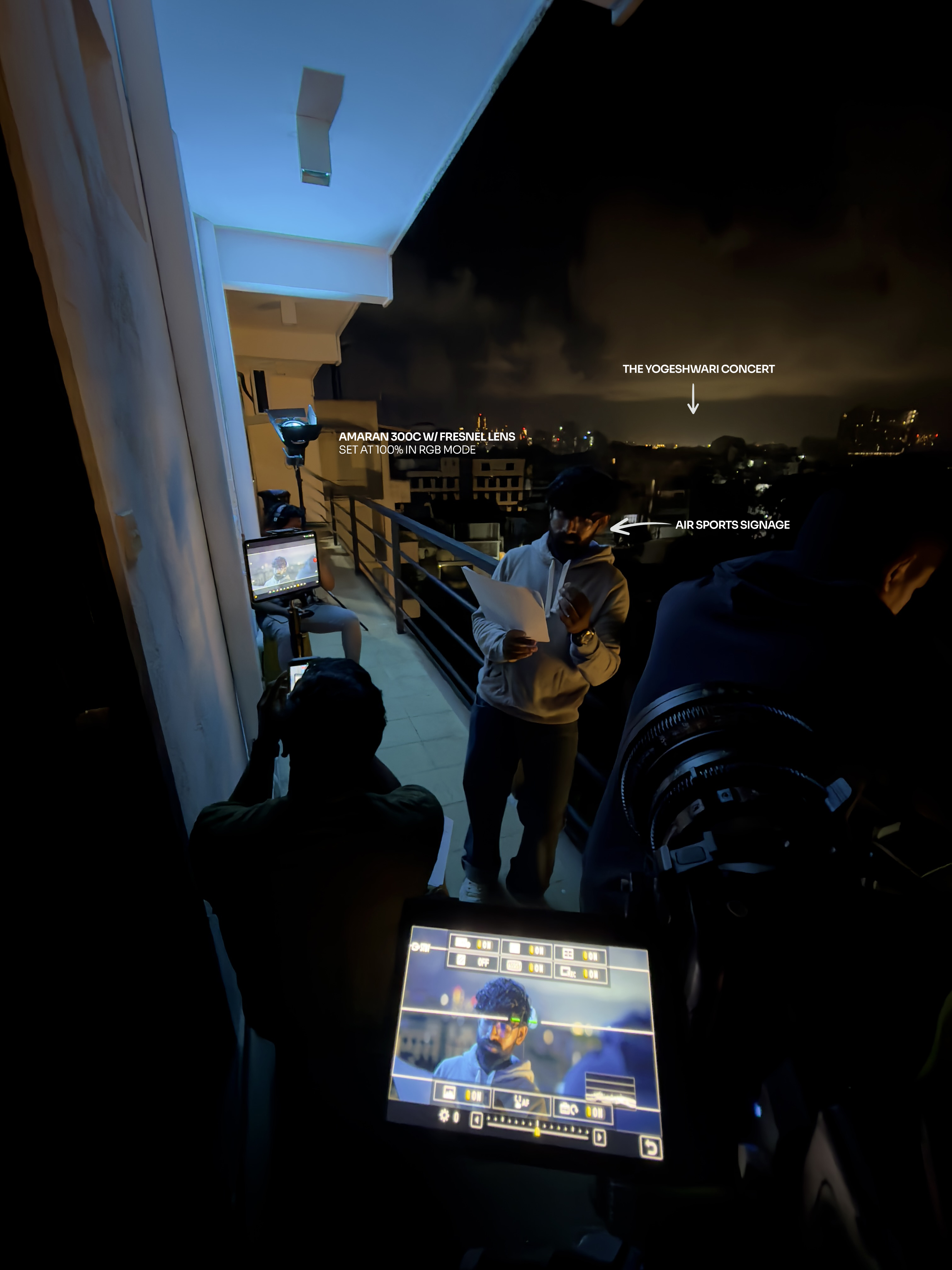
LAZY LIGHTING SPECIMEN NO.2 I mean, the photo is self explanatory - the 300C bounced into the wall with the fresnel lens to reduce any light leaks + the signage from Air sports as our key light from the right and the distant concert to light up the sky lol.
Cinema 🧀
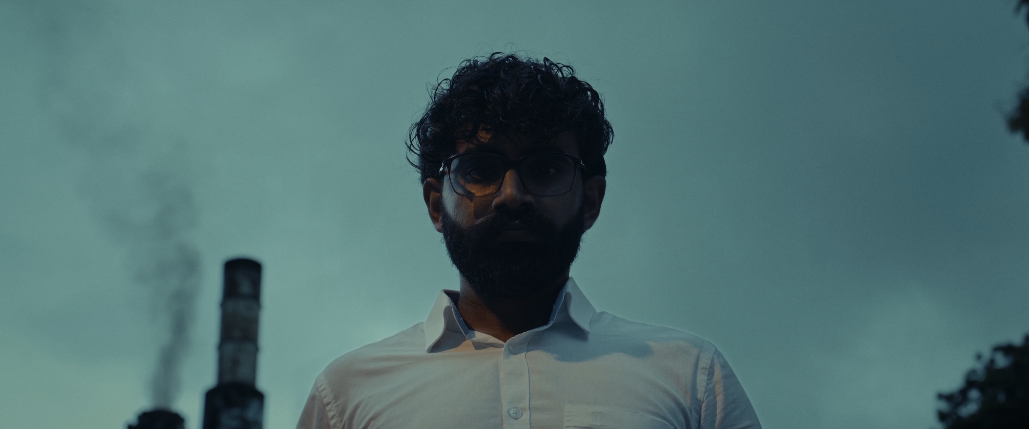
LAZY LIGHTING SPECIMEN NO.3 Sun, clouds, a distant street lamp 👍…. and my favorite colorist somehow figuring the rest out.
Did I also tell the story about how I had to also be the focus puller?
A manual cine lens, wide open aperture at 2.1, no follow focus kit, no external monitor to track peaking, no 1st AC paired with two characters who keeps on moving in the focal plane spontaneously - all I could do was….
Random bullshit go and hope for the best. Budget filmmaking at it’s finest!
Anyways, after watching the Odyssey, I felt like I wasn’t too bad after all *wink wink*
It’s colouring time
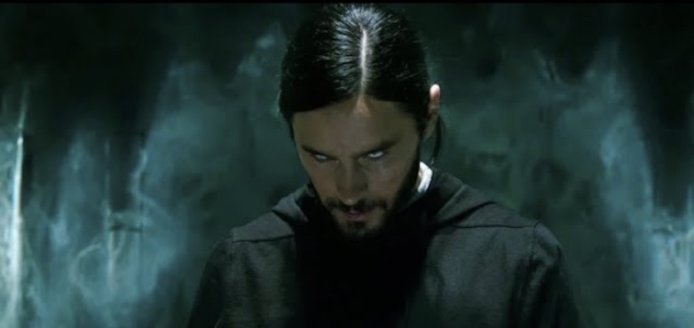
Okay okay, without going too deep into the technical part of the grade let me just showcase how the grade usually builds.
For this grade - Dehancer was my look development tool of preference though that changes from project to project. I combined a film stock of Kodak Vision3 250D along with a Kodak 2383 FPE to create the base look. From there, everything else is a matter of adjusting the exposure & tones, saturation and the colour balance to get where we want.
But true magic comes from *drumroll* - masking!
Look at these two shots from the first scene, Both got all the adjustments except the local masking adjustments.
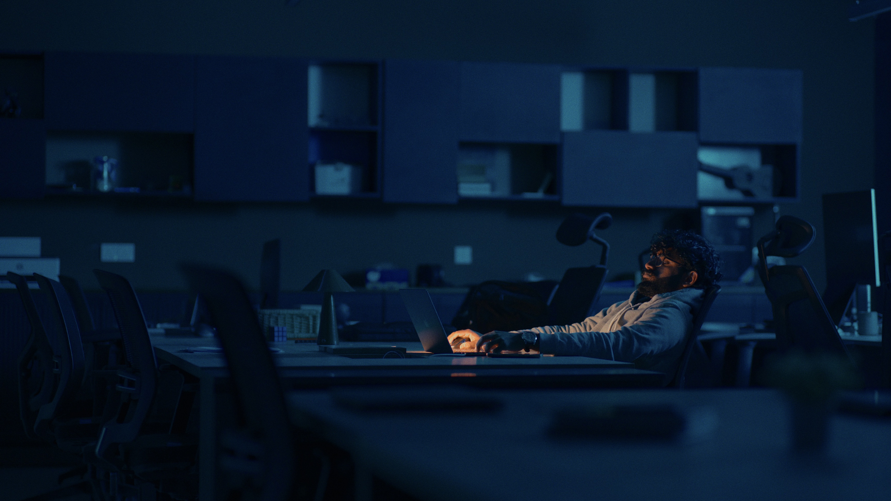
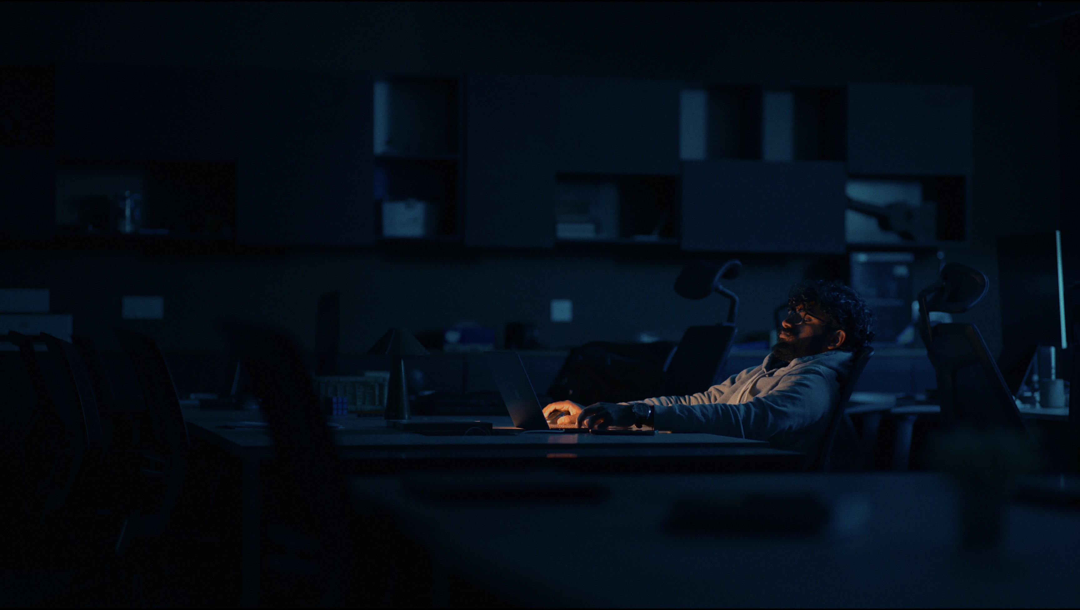
Creatively using masks in any form - whether it’s qualifiers, AI magic masks, power windows or a combination of all - is where you can make a big difference between going from 75% of the grade to 95% and truly pushing the look to how you want your viewers eyes to travel.
Conclusion
1. Don't think, just do
2. Do more
3. Colour grading is too hard to explain on a blog
4. We need to allocate separate T&C Originals budget
5. Media Storage is expensive
6. Apurture/Amaran should sponsor us
7. My fingers hurt
Thank you for reading! See you again in a year when we finally finish another T&C Original.